
This image was taken in the evening in Ragusa Ibla, Sicily. I was making my way back to my b&b and came across this piazza. I had seen the little boy go into one of the doorways on the piazza and wondered if he might come back out. I waited, he came out, I got my image.
Why did I convert this to black & white? I based my decision solely on mood. In this instance I just felt this image had to be in b&w.
But that doesn't help when you may have thousands of images to look through from your recent travels and you want to know which ones are going to work in b&w - if you went by your mood and feelings it might take all day just to get a handful of images selected!
Is there a better way?
The best b&w images come from colour images with excellent light, tone, contrast and composition, but identifying those elements can be hard if you're new to photography or unsure of what these terms mean.
Without going in to too much detail (I run a course on b&w photography, so believe me I know detail!) I think there is a simple starting approach to figuring out which travel images may have b&w potential.
Please be aware that this approach is certainly not the only approach, nor will it necessarily be the best approach, but it is a way to get started. From here you can hone your skills and knowledge on b&w as you will start to realise which images work and which don't, and you can ask yourself why.
When to convert to b&w?
Sometimes I convert to b&w because I want a point of difference in a commonly-photographed scene. It could be the Taj Mahal, or Big Ben, or in this instance the Fontana di Trevi. We see so many images in colour, that a b&w version might be a way to differentiate your image.

When an image has strong shapes. Shape is one of the key elements of design and without colour, shape can really stand out and be a feature of an image.

When an image has good texture. Another element of design, texture can be featured without the distraction of colour.


When an image has lots of people or objects which can be distracting or overwhelming in colour. Removing the colour around the nuns allows them to draw our focus:

Likewise with the colour of the food at the market removed we can focus on the interaction between the vendor and the customer:

With the colour removed in this image we are able to focus on the people and their interactions and expressions, rather than their clothing:

Finally, sometimes I convert to b&w to salvage coloured images that have issues. In this image it is to make the most of a blown-out sky (top right-hand corner):

How to convert to b&w?
How long is a piece of string? B&w conversions can be done in so many ways using so many different products that it is beyond the scope of this blog.
My big tip is to consider using a method that has presets (many of which are based on the old film-days of coloured filters, and many of which also tweak contrast and exposure/brightness). This is a good way to get started.
As a guest tutor for Bluedog Photography Workshops and Tours, I run b&w workshops in Queensland, Australia and soon to be online also.
If you would like to know more: http://www.blue-dog.com.au/
Equipment and settings used in top image:
Camera - Canon EOS 5D
Settings - f2.8, 1/250s, ISO 1600, auto white balance, neutral picture style, shot in RAWLens - Canon EF 24-70mm f2.8L USM LENS
Focal length: 24mm
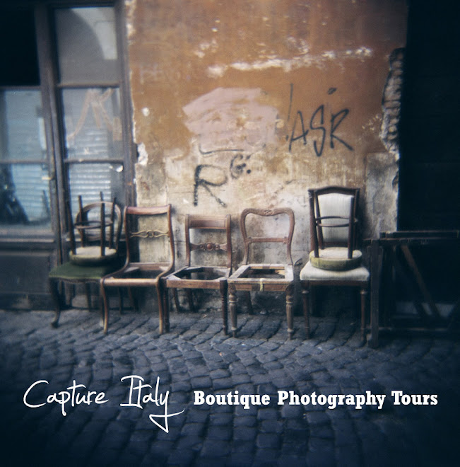
Happy Shooting from Lisa and Dianne at Capture Italy
http://www.captureitaly.com/


