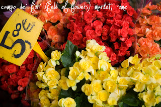
 The story behind the image:
Photographing food can be a lovely way to capture the essence of a country, particularly Italy where food is such an important part of the culture. On our last visit Dianne and I joined a cooking class on the Amalfi coast and not only had a wonderful time making the food, we also thoroughly enjoyed shooting the action in the kitchen.
We made crocchette (using the potatoes in the scales above):

We made gnocchi: 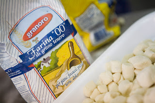
We also made a classic local dessert, Delizia Al Limone:
(consider shooting the different stages of a dish)
(consider shooting the different stages of a dish)

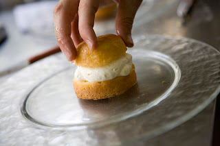


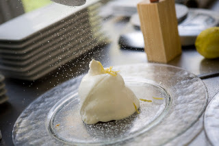
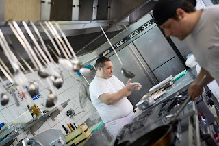
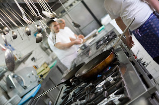
When shooting in a working kitchen you'll find your backgrounds quite busy/distracting/messy/not all that attractive so you need to be aware of that when composing your images. You'll have to either zoom in and get close-ups of the food (as in the images above), or you make the most of the background and include the kitchen and some of the chefs (as in the images below).
 The best part of the class was eating the wonderful food we had prepared:
At various times during the class Dianne and I were torn between wanting to learn how to make these delicious recipes and wanting to capture the images in front of us. This will always be the photographer's dilemma - being in the moment or capturing the moment. Have you also had that experience? We would love to hear your stories...
Photoshop post-production for scales image:
Levels layer to increase contrast.
Equipment and settings used:
Camera - Canon EOS 5D
Settings - f2.8, 1/800s, ISO 800, auto white balance, neutral picture style, shot in RAW
Lens - Canon EF 24-70mm f2.8L USM LENS
Focal length: 70mm
Happy shooting and buon appetito, from Lisa and Dianne at Capture Italy.


